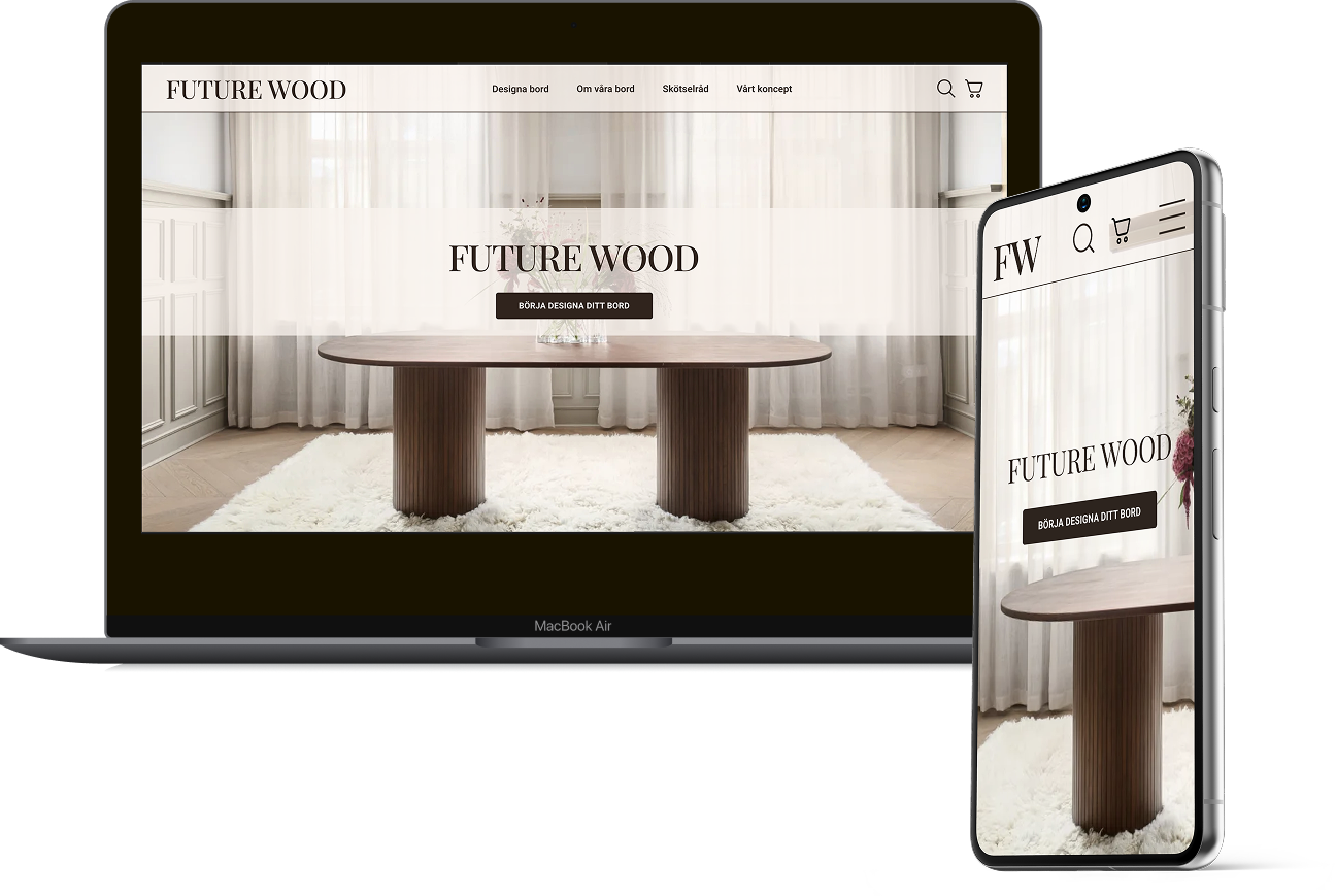
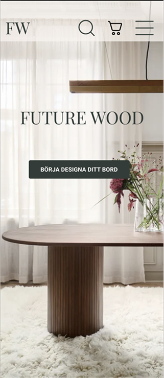
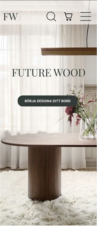
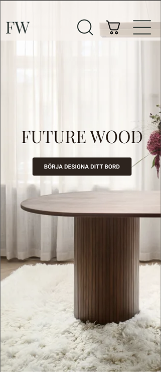
FUTURE WOOD
MY ROLE INCLUDED:
- UX RESEARCH |
- WORKSHOP FACILITATOR |
- UI DESIGN |
- USABILITY TESTS |
- SCRUM MASTER
How might we help customers design high-quality, sustainable wooden tables that fit their unique needs, while ensuring a smooth and intuitive shopping experience?
Problem
Many customers seeking high-quality wooden tables struggle to find products that align with their specific aesthetic, functional, and quality expectations. They often experience uncertainty about material choices, durability, and customization options. Additionally, online furniture shopping can feel impersonal, making it difficult for customers to feel confident in their purchase decisions. The lack of clear, structured guidance in the customization process can result in frustration and abandoned carts.
Solution
Future Wood provides an intuitive platform for designing custom wooden tables, balancing simplicity with flexibility. Trust-building elements like quality certifications and sustainability transparency enhance user confidence.
Research & ideation
Both qualitative and quantitative research through competitor analysis, user interviews, and usability testing to understand customer behaviors and pain points.
Key findings
- Most users needed a structured decision-making process for confidence in their purchase, while others preferred a faster buying journey.
- Trust indicators like certifications and sustainability details were crucial.
- Familiar e-commerce structures improved usability and engagement.
- Mobile accessibility and clear visual hierarchy boosted conversion rates.
Based on our research, we identified three primary customer personas:
The quality-driven
Prioritizes durability over time, considers material quality crucial.
The pragmatic
Takes personal circumstances into account. Values easy maintenance.
The design-conscious
Value material aesthetics and has a personal style
Painpoints and opportunities
- Uncertainty about material choices - Provide clear material guides and quality certifications
- Overwhelming customization process - Introduce a structured, step-by-step flow
- Need for trust and credibility - Higlight sustainable sourcing, quality assurance and real customer testimonials
- Lack of visual support - Use an interactive preview tool and high-quality product imagery
Prototyping
An iterative design process followed, where we conducted many tests and gathered feedback which refined our interface further.
Key features
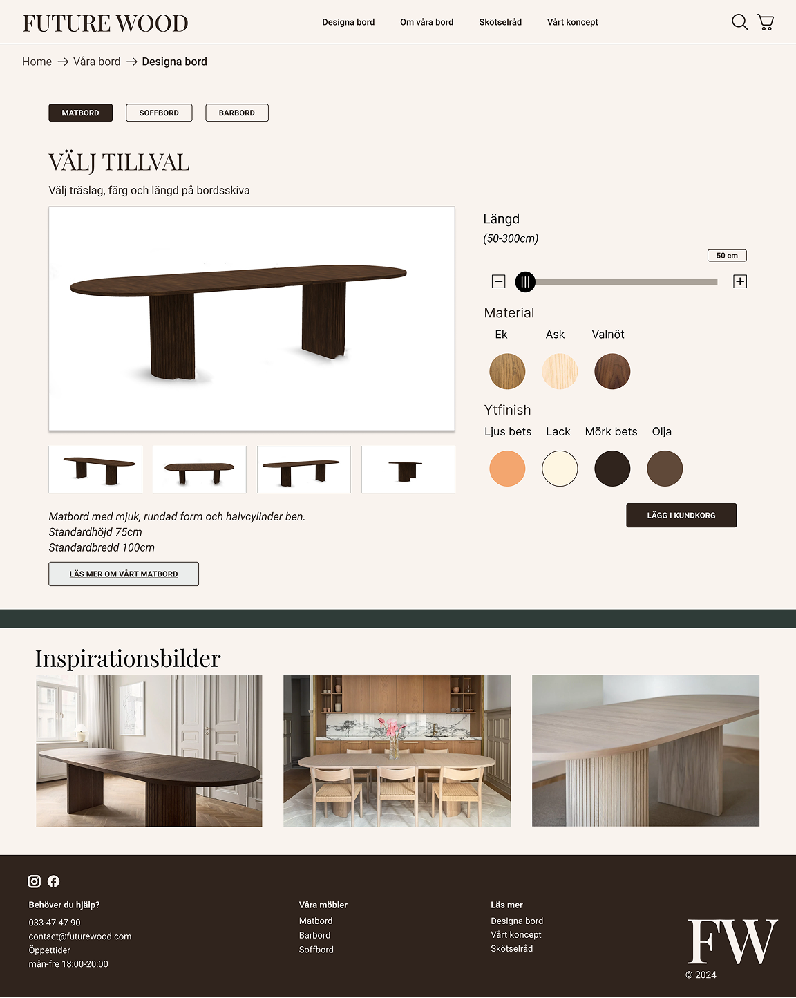
- Custom table builder that allows users to adjust dimensions, materials and finishes through an intuitive interface
- Quality certification that displays sustainability and craftmanship
- Visual product preview with high-quality images and interactive previews to help our users make informed decisions
- Streamlined checkout flow to provide a frictionless, structured process with minimal cognitive load
- Mobile first approach to ensure accessibility and ease of use across all devices
Design choices
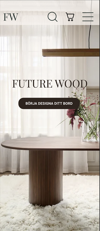
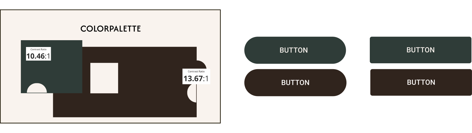
To align with our brand values of exclusivity, clarity, and modernity, we opted for a neutral color scheme with earthy tones to reflect natural material. The structured layout and rounded UI elements invites to a intuitive shopping experience while keeping a soft and inviting feel. A high-contrast typography for enhance readability and accessibility was crucial.
After initial refinements, we conducted usability tests to validate the design. Users were asked to customize and order a dining table based on specific parameters.
Findings and adjustment
The flow was intuitive, and all participants completed the task, but several insights led to improvements:
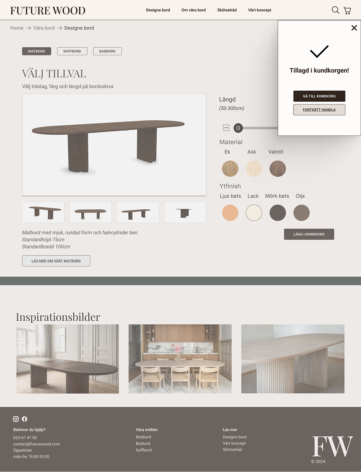
- Limited interactivity in the prototype required clearer expectations.
- Lack of price visibility until checkout was a major oversight.
- Button labels and navigation needed more clarity.
- Quality certifications needed more prominence.
- Checkout terminology was adjusted—“Go to Checkout” became “Proceed to Payment.”
Post-test refinements included dynamic pricing updates, enhanced product image responsiveness, and better trust signal integration throughout the journey.
Key take aways
A structured customization process made the shopping experience intuitive and engaging. Transparency was essential - users needed clear pricing and visible trust signals to feel confident in their purchase. Mobile accessibility remained a priority, as most users accessed the site via their phones. The checkout experience played a pivotal role in conversion, and refining its clarity directly impacted user satisfaction.
Final thoughts
Going through the entire process from research to implementation reinforced the importance of an MVP approach, focusing on the essentials first and iterating based on feedback. Being able to defend design decisions with usability insights strengthened our approach, particularly in ensuring accessibility compliance. Effective team communication and structured retrospectives were key to smooth collaboration and problem-solving. Lastly, consistent documentation throughout the project ensured a strong foundation for case study presentation.